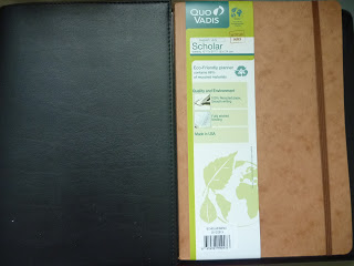
As you can see it is fairly eco-friendly with 88% of it made from recycled materials and made in the USA.
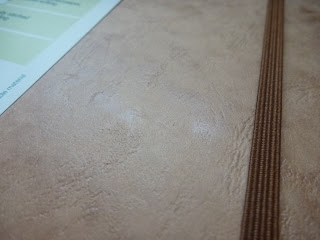
Here is a close up of the nice texture of the cover. I actually like this cover, you could probably paint or draw on it if you wish. That would have been a lot of fun but I figured my mom had better uses for it than me since I planned on using the House of Doolittle Planner. It’s because I preferred the hourly format in those planners compared to this layout (more further down).
It has sewn binding, but it needs some encouragement to lie flat. I assume after some use it would lie flat on its own but because it’s new it needs some breaking in. Although I do like the cover I am afraid that the cover will get worn down easily as you can see the edge of the spine is already tearing a bit and I haven’t really used it. I also get a bit rough with my planners if I’m in a hurry.
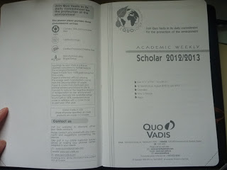
The first couple interior pages are shown below. It’s the standard information about the planner. Read at your leisure. 🙂
Interesting hourly page I suppose it’s for you to plan for an important week? I think it only had one or so pages of these, I forget how many exactly. I already gave the planner to my mom. haha
A page where you can see everyday of the year at a glance. Useful for important dates, holidays, or big milestones. I admit I hardly use these types of pages. The slots are so small for me to write in it and I don’t usually plan that far ahead. lol Someone else might use these so it’s still nice to have. Especially the holidays.
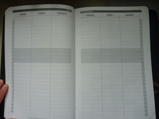
Now to the guts of the planner, I used to use this style of planner for school and it was helpful because I listed tasks/homework assignments. They also have the tear off at the corner of the pages but I didn’t use that in my Space 24 but those are still nice if you use them.
I also like the little priority boxes under the date so you can prioritize or set a to-do list. Although, I’m not sure I’d be able to fit all I want in it. I do like the large date number but feel like the page real estate could have been better utilized. I suppose I could write the stuff that couldn’t fit under the last empty section of the first page. I just think that the layout was a little strange to me but it just might be my preference to the hourly schedule.
To explain, I use the hourly schedule so I can block times based on the day which makes it easier for me to plan. This week-day type of schedule is still useful but I primarily think it works better for those who are task based planners. I could also write in my own time blocks if I wanted but I’m lazy. 😛
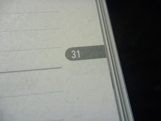
It has the week number listed in the middle which I think is interesting. I’m not sure how many of you use those but I hardly ever do. lol
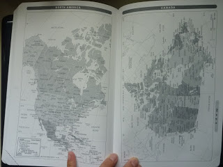
Maps! Sorry they are kind of blurry but you get the picture. lol
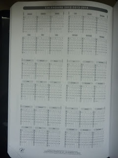
This page gives you the days in 2012, 2013, AND 2014 which I thought was interesting enough to share.
Ok, so what I didn’t love about the cover was the little metallic end of the elastic enclosure. I think it would make using the last few pages of the planner a little annoying to use because of the slight bump. I’m probably being extremely nick picky about that but for the most part the last few pages are just filler pages like the maps so I suppose it wouldn’t be as much as a nuisance as I think it would be towards the end.
The little indentation that the metal end of the elastic made on the paper. You can see it right? *squints*
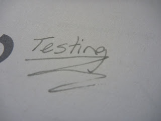
For you fountain pen users, you probably wanted to know how fountain pen friendly is this paper? As always these planners deliver with fountain ink friendly paper. This is me using my Lamy Safari F nib with Noodler’s Lexington Gray. 🙂 Just so you know, this paper is like writing on normal textured paper, it’s not smooth like the Space 24 or like a Rhodia/Clairefontaine paper.
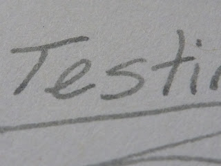
Close up, no feathering!
This is the back, no bleed! A tiny bit of show through but hardly noticeable at all! I definitely don’t mind using the back.
Overall, this is a great planner but not one for me (my heart is set with the Space 24). It’s fountain pen friendly and is nice if you’re in school and use this type of format but I no longer prefer this layout. The planner cover looks fairly durable with care but could involve some fun customization for you creative types. It’s a great size, perfect to fit in a bag or backpack as it doesn’t take up your whole desk. It’s a nice planner, perfect for you scholarly types. ^_~









Be First to Comment