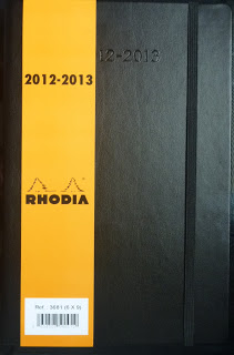
This is a nice cover, very much like the Moleskine. I prefer the inconspicuous black versus the bright orange, just my opinion but the orange is nice too. The cover is what I describe as a semi-hard cover. It bends slightly but it’s stiff enough to not need a hard surface to write upon if needed.
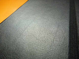
A closer look at the texture of the calendar cover and elastic band. I like the texture, it’s smooth but has enough grip so it’s easy to grab in a hurry.
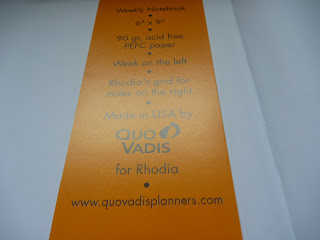
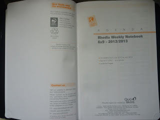
Pretty self-explanatory, just the little information on the inside. I appreciate that the paper is recycle-able and that the paper came from sustainable sources.
Contact information which is always useful but something I don’t always fill out but you may have a use for it. The international phone access codes are interesting and new to me. I don’t go out of the country much but you travelers may find this useful.
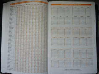
More international information, this time, temperature. lol It shows the temperatures of the world in Celsius instead of Fahrenheit. Crazy Americans…we had to change our unit systems….Then on the other page is a 3 year look ahead, 2012-2014, which may be useful if you need to look that far ahead.
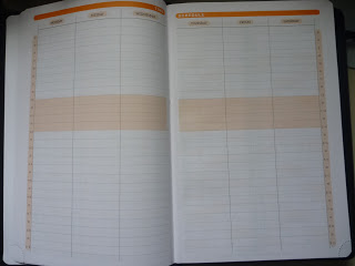
I like this layout, as you might already know, I prefer the hourly layout which helps me plan and block times. Unfortunately there are only a few pages of this which I suppose one can use for big or important dates.
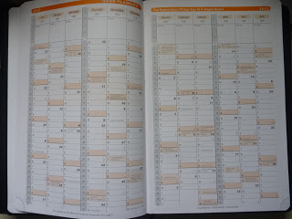
At a year glance for those who use it. I do like the cycles of the moon and the holidays established. It is a bit weird that it starts from July 2012 and ends June 2013 but I suppose it’s to allow some leeway for future buyers in case they weren’t able to purchase it right when the year started. I do like the priorities box at the top to list important information. It doesn’t get in the way when looking at the actual calendar.
This is the actual calendar layout. I do like the layout of this planner. Fairly standard and minimalistic design. As usual I do wish that the hours extended a bit more in the night but has the standard 8 to 5 work day on there. I like the different color uses of the day of the week and the date, it makes it easy to distinguish between the two.
Now I love that almost the whole right side of the page is open for notes because I tend to scribble lots of stuff in them. I’m not quite sure how I feel about the grid…it’s a bit darker than I’d probably like but I’d be able to work around it. I would love to see dot grids instead if that was an option. I can’t complain, but that is a reason why I’m keeping this calendar for other uses. I do like the 3 month view at the bottom, I do use that from time to time so it’s pretty useful to me.
Ah, I almost forgot, there is a little tear off at the corner for those of you who use them to keep track in your planner. I just never got around to tearing the edges off, I don’t like wasting the paper and I don’t like having to worry about throwing it away. Most times the planner is worn so that it flips exactly or close to the actual week for me so it was never an issue finding my page immediately.
Maps and timezones! There were more maps but decided this was probably good enough to show you. I’m not sure many of you actually use the maps in your planner unless you travel a lot.
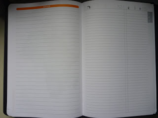
Another notes page if the regular pages weren’t enough for you. Then it looks like an address and phone book which is also something I don’t use regularly but probably should in case I lose any information. lol
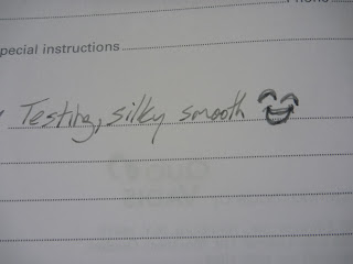
Testing the pages with a Lamy Safari Fine with Lexington Gray. Silky smooth as many of you probably already know. I love this paper, I see why many people fall in love with it. 😀
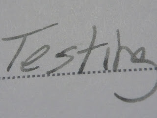
Close up and no feathering! No bleed through and only a hint of a shadow but it’s totally acceptable.
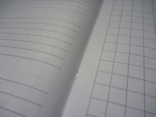
Closer look at the page texture if you’re curious.
Overall, highly recommended! The reason I didn’t use this planner is because it ends July 2013 and I would prefer a full calendar year so I settled for another one that had the whole 2013 year. Nevertheless, I still intend to fully use the calendar for it’s paper. Perhaps not for it’s intentional uses but I can’t waste that wonderful paper!
Do you guys use old calendars? If so, how do you use them?




The dates on this calendar make absolute sense to me. I have a lot of friends who are college professors – a calendar that is July to July makes sense for them. I also know some accounting folks whose year end close is June, so starting a new year might work for them as well. I can't imagine a student being able to afford a Rhodia calendar, but that's another option.
I never purchase my calendar until January is over. Nowadays I put together a simple page to hang up for the first month of the year. I use electronic calendars (it's not an option – my job requires it), so my wall calendars are a form of decoration, not a useful item.
I miss picking out a calendar for each year, finding just the right one that will work the way I need it to. That was how I used to keep my college days. By post-college I was already transitioning to electronic because I was sharing a calendar with another person. Blah.