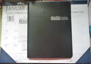
The two products I received are House of Doolittle Two-Color Monthly Desk Pad Calendar with Large Notes Section and Wirebound Weekly/Monthly Planner. Below are the two items stacked on top of each other. The Desk Pad came shrink wrapped for protection, the Planner was not so when it got shipped some of the tabs and pages were bent but nothing a little heavy weight for a couple of days won’t fix. Plus I tend to beat my calendars up so the wear does not put me off too much.
I’m going to start with the House of Doolittle Wirebound Weekly/Monthly Planner first. It’s about letter size so 8 1/2 x 11 which is nice but a little large for me to carry around. I’d use it more as a desk or stay at home planner.
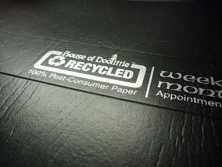
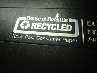
Below are some photos of the cover and the logo. I like the logo design because it’s small, self-explanatory, and is embossed with silver metallic lettering. I love shiny lettering so this is a nice touch in my opinion. Emphasizing the recycled elements with the 100% post-consumer paper is nice to identify for those Eco-friendly consumers. The cover itself is textured as you can notice the wrinkles in the cover. It seems very “plastic-y” in terms of fee. I’m not a huge fan of how it feel but it’s pretty durable. I scratched and scuffed it a bit with my fingernail and it seemed to clear up or blend in with the texture of the cover after rubbing it with my finger.
Trying to show the metallic silver embossing because it’s pretty. XD
Now to the guts of the product, the paper. I actually like it, it’s a bit off white kind of gray color which is due to the recycled paper. Doesn’t bother me any as I’m pretty lenient with colors of pages that I write on. I think it’s a nice cool color that isn’t hard on the eyes when you use it in bright lights. It’s slightly textured but not enough to bug me when writing but it’s not super smooth if you like that.
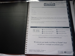
The first page gives the standard contact information if you ever lose the planner. You can see the slightly bent corners at the top and bottom right as well as the tabs. I smoothed them down a little before taking the photos. I really love the tabs for each month. Makes it extremely easy to flip to the month you need. Love the explanations on what percentages are recycled components. The reorder code at the bottom left is very convenient for customers who love this product! Most times you have to search for it.
Re-emphasizing the recycled components and the certification that the paper is coming from legitimate sources and not claiming recycled elements without proof or certification.
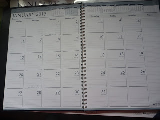
A shot of the monthly view with the notes section. Nice and spacious with large numbers for each day. Standard look, nothing too special about it which is fine with me, I don’t really expect a lot of deviation from calendars.
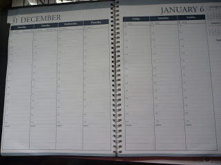
I like the linear design, makes it easy to refer to certain days. You can look at the week in just one glance. I haven’t quite started using the planner as 2013 hasn’t started yet but looking at the spacing of one line per half hour concerns me a little as I write a lot. Looks like I’ll have to learn to abbreviate more when I use this planner. I like the little memo section and the notes section, perfect for a To-Do list. 😀
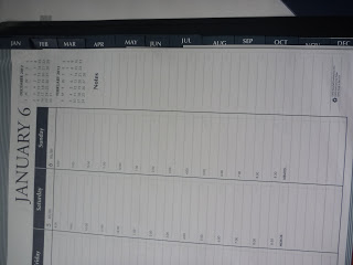
Just showing the tabs a little more. Nothing spectacular but easy to grab and flip to the section you want.
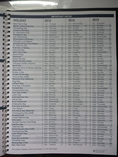
Holiday page! Can’t be a calendar with one. lol
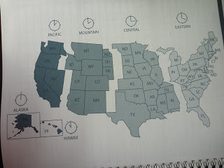
A timezone map is nice but I probably won’t use it often. lol Good if you travel a lot.
Address and phone section if you use those. I personally don’t but always nice to have just in case.
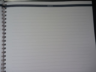
Larger memo section for notes or what not. 🙂
Interesting in case of emergency contact information. Not sure if anyone would know whether or not this information would be in the back of a planner but good to have if you have a medical condition.
I like the little timeline section. It gives you a brief history of how the House of Doolittle began producing recycled products. It shows you do it step by step and it’s nice to be reminded that it all can’t happen at once.
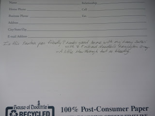
Testing the paper with my Lamy Safari with a Fine nib and Noodler’s Lexington Gray. Looks pretty good! No feathering! It might feather with wetter nibs but I always write with F or EF nibs. There was no bleed through for me. There is a little show through but not enough that bothers me.
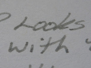
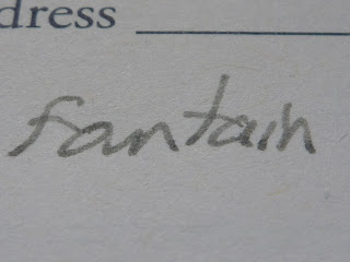
Closer shots of the writing. I think it looks good. Please ignore my bad handwriting. lol
A little comparison to my current Quo Vadis Space 24 Planner which is half the size, I would prefer a slightly bigger notes section and half hour spacing. I do like the recycled elements but my Quo Vadis planner is refillable while this planner is not.
Now I’ll switch to the House of Doolittle Two-Color Monthly Desk Pad Calendar with Large Notes Section. Here it is shrink wrapped. It’s a typical desk calendar.
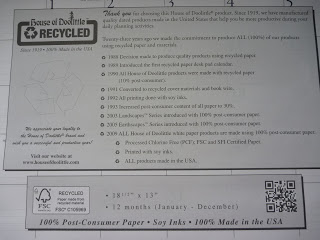
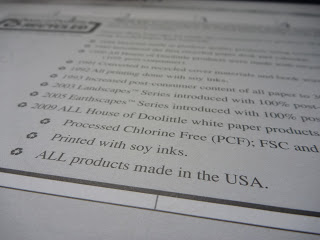
Similar information explaining the timeline process of going green.
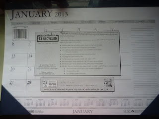
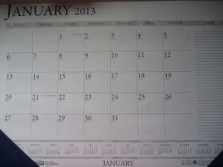
Unwrapped and removed the cover page. Sorry for the shadows, my desk was a bit messy so I didn’t have a lot of room for a nice photo. Typical desk calendar. Very spacious and I really like the notes section off to the right.
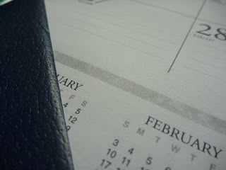
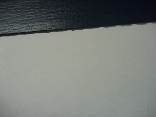
Just showing the plastic corners. Seems to be a similar material to the cover but less stiff. Not sure if it’s made from recycled materials too but I assume it is by the way it feels and the brand of this company.
The paper is pretty much the same as the planner, so highly recommended. No bleed through but a little show through, not enough to bother me. 😀
Perforated at the top for easy tearing.
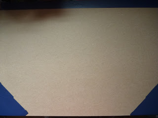
Here’s the back of the desk calendar. Just felt like showing it. Not as clean as the front but no one looks at the back when you’re looking at the front side (except me apparently lol).
The corner was loose. Don’t think it’ll come off but thought I’d point it out. Keep it flat and it should be fine.
**Disclaimer: These products were provided by Shoplet and in return for this review I was able to keep the product in exchange for an honest review.






Be First to Comment